

Microsoft to redesign Windows 10 core icons
![]() Microsoft is upgrading the icons in Windows 10 and other products with the first changes rolling out in Preview Builds already.
Microsoft is upgrading the icons in Windows 10 and other products with the first changes rolling out in Preview Builds already.
It has been almost five years since Microsoft released Windows 10 to the public. In the meantime, there has been plenty of feature changes and improvements made through periodic updates to the operating system, but much of its icons remain the same as they were initially. Microsoft admits that user feedback shows a desire for its core products to get a new lick of paint.
Microsoft did update the icons for its Office products in the meantime, and will now more onto other products. Updates to built-in apps like Alarms & Clock, Calculator, Mail, and Calendar will be the first. In fact, Mail and Calendar icon updates have rolled out with the latest Release Preview for those in the Fast ring.
"Research shows that people want consistency in design and connection to brand, with enough differences to aid in recognition," writes Christina Koehn on a Medium.com blog post about Microsoft's approach to updating and modernizing icons in Windows and its other products.
 Netflix picks Valentine's Day to release a surprise teaser for Stranger Things 4 - From Russia with Love.
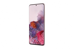 Samsung has unveiled three new handsets in its Galaxy S- line up which support 5G wireless connectivity, and pack powerful camera features.